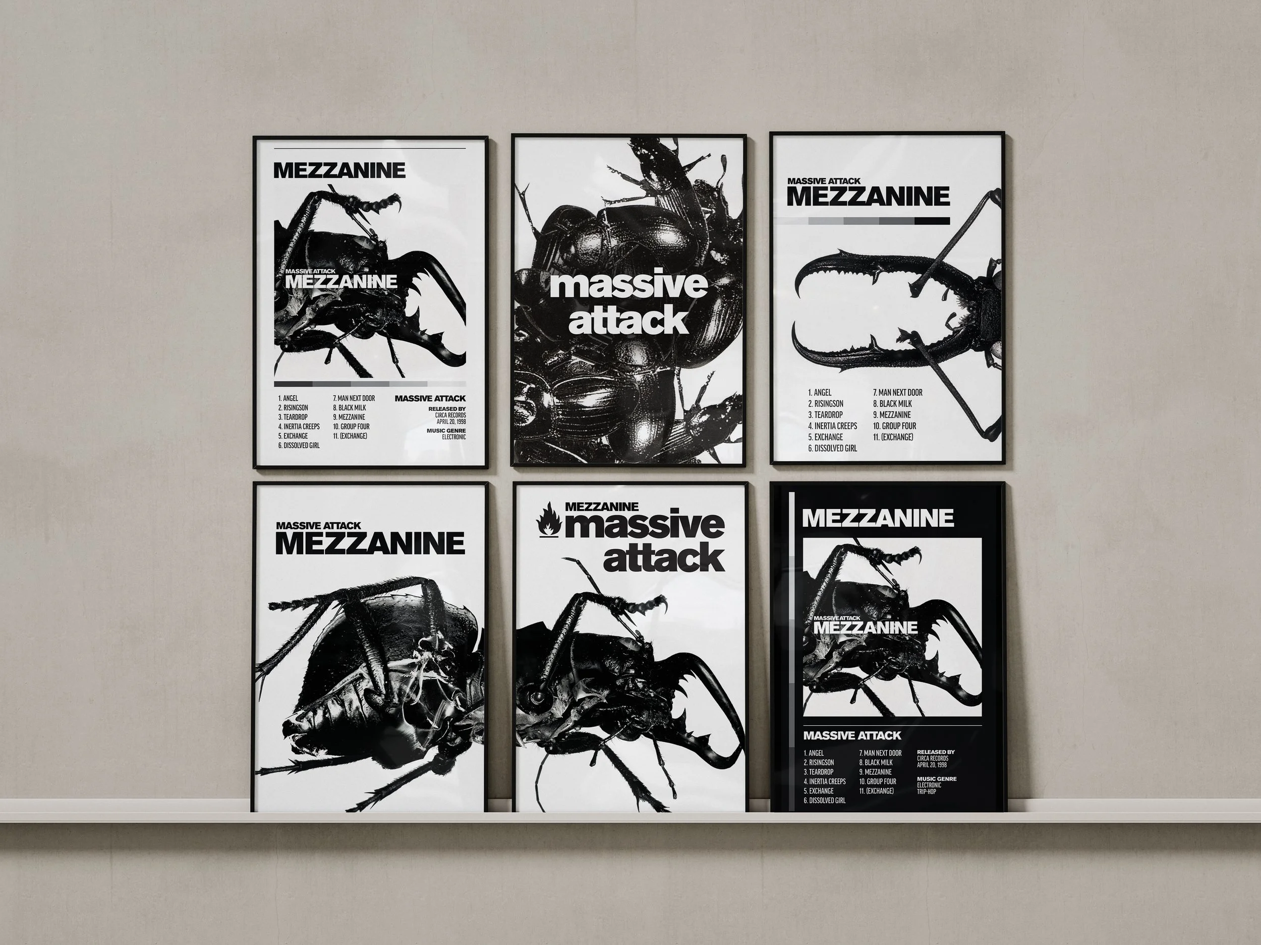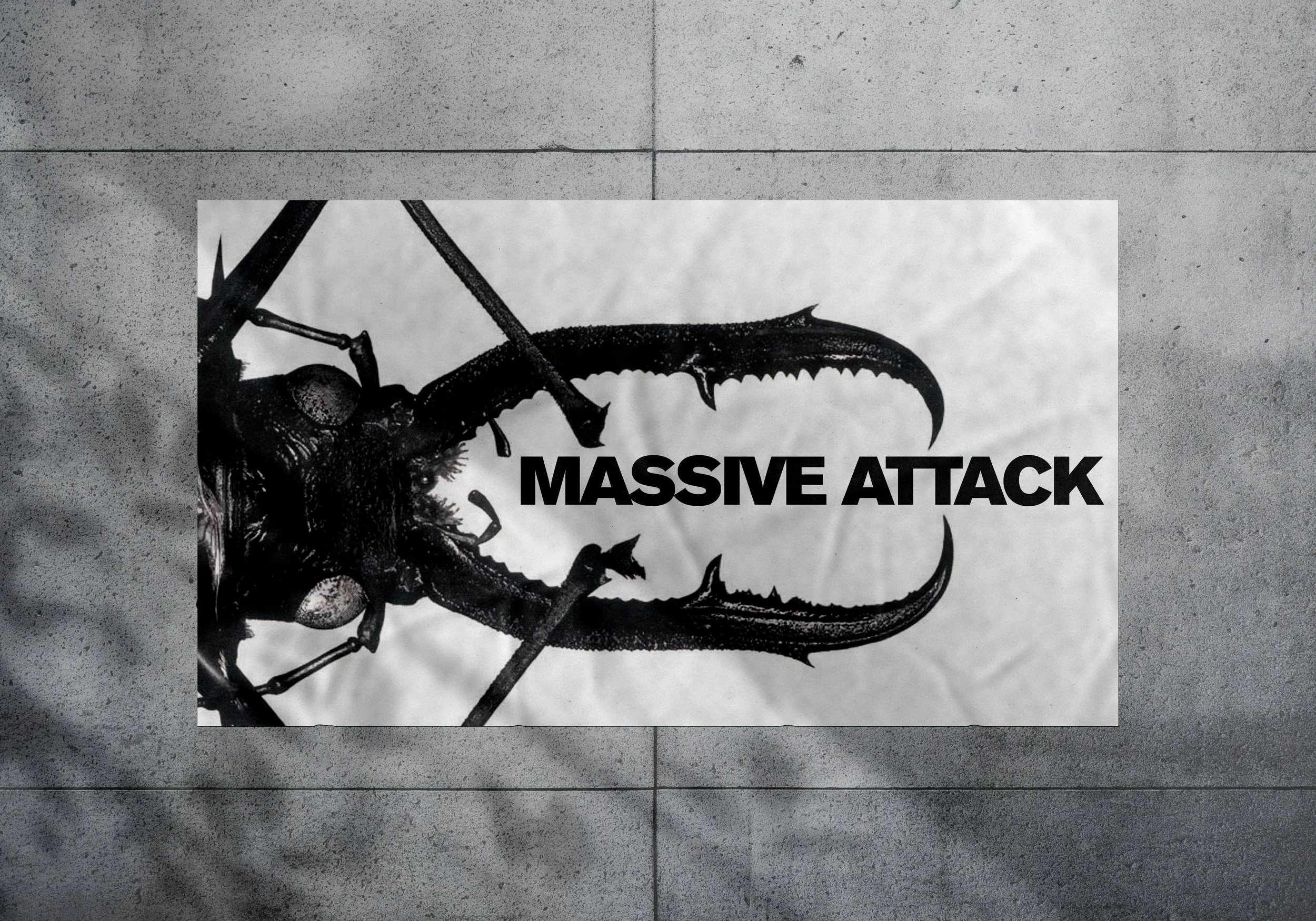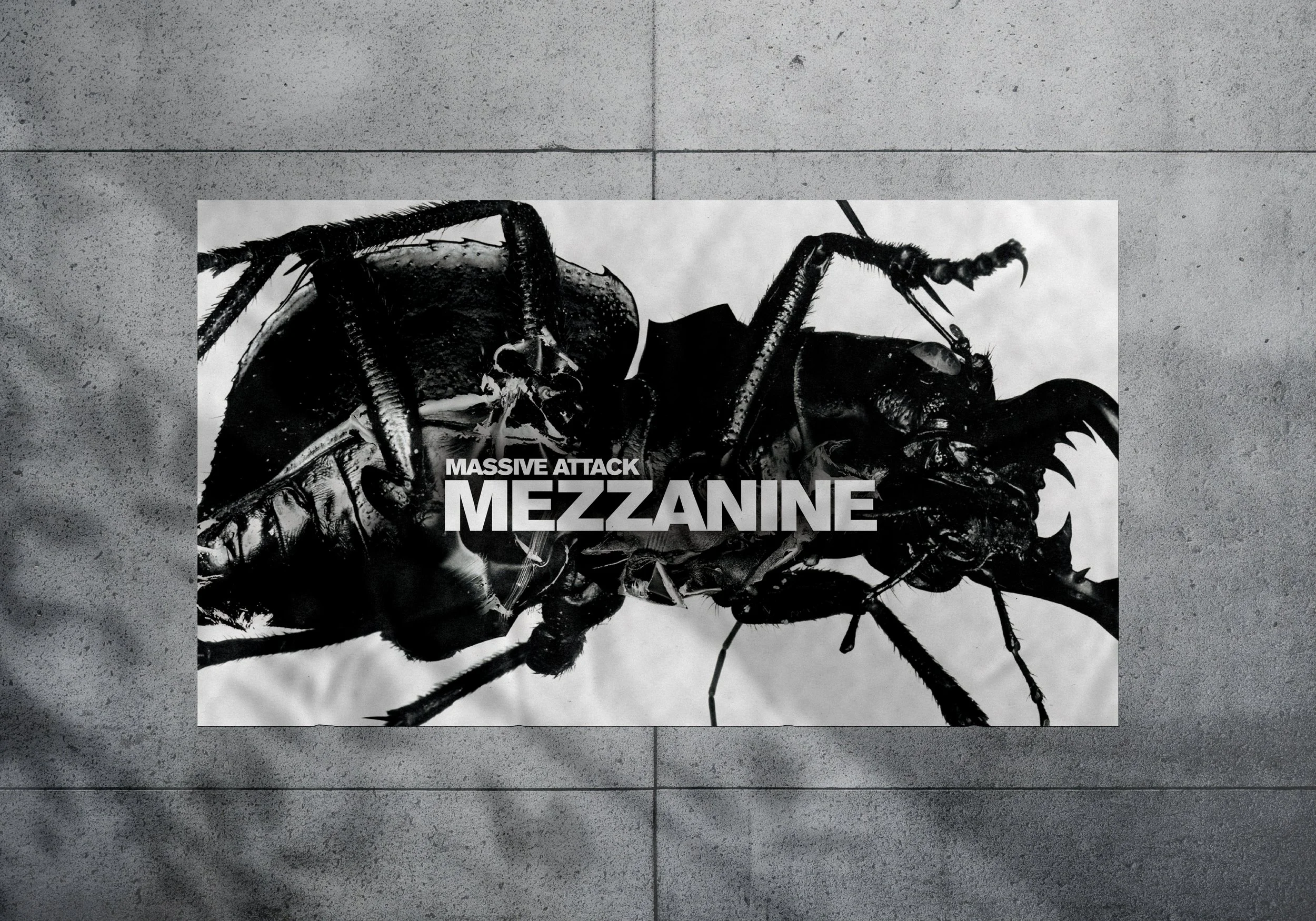
Massive Attack Poster Series
This project explores a minimal, typography-focused approach, using negative space to create balance and guide visual hierarchy. By emphasizing scale, alignment, and spacing, the design directs attention to the text as the primary element while maintaining a clean, modern aesthetic. The result highlights how reduction and thoughtful composition can create a strong, cohesive visual impact.